Case Study: Heem

Background
Client: Heem
Duration of Project: 2 weeks
Heem is an app that utilizes augmented reality (AR) to help users visualize furniture in their space and bring home the perfect piece of furniture.
Heem believes that offering a truly big catalog makes a significant difference to the user experience and furniture, they believe, shouldn’t come necessarily from only the same store. They’d like to provide an app to customers that allows users to view a catalog of furniture and place it in their home via AR.
Design Goals & Objectives
Design a new end to end app that helps users browse furniture and view products in their homes using AR
Define a unique brand identity that reflects Heem’s attributes
Empathize
Research Goals
What other companies have or are developing AR apps in the market?
What are the current issues & difficulties around buying furniture?
What is users purchasing process?
What are the main deciding factors in purchasing?
Methodologies
I first started researching for existing AR apps. I came across a lot of competitors such as Houzz, DecorMatters, Homestyler, Ikea Place, Hutch and Pottery Barn 3dRoomView. I quickly learned that my phone is not compatible with the AR technology so I wasn’t able to download the apps. As a workaround, I ended up borrowing my friends’ phones and watching videos of users rating each app online.
After getting a sense of the marketplace and the different apps, I started my user research.
User Interviews
3 participants (2 female, 1 male)
Age ranges: 26-30
Varying professions, marital status, education, number of members in household
Key findings
Options - Too many options made choosing difficult
Comparison - All users cross referenced prices while shopping
Filters - All participants used filters when searching for furniture
Price - Price was the most important to users when searching and deciding between two items
Define
Project Goals
Once I completed user interviews, I listed Heem’s goals to find commonalities of what I needed to solve for in my design.

App Map
I created an app map under the assumption that users would categorize the items in this manner.

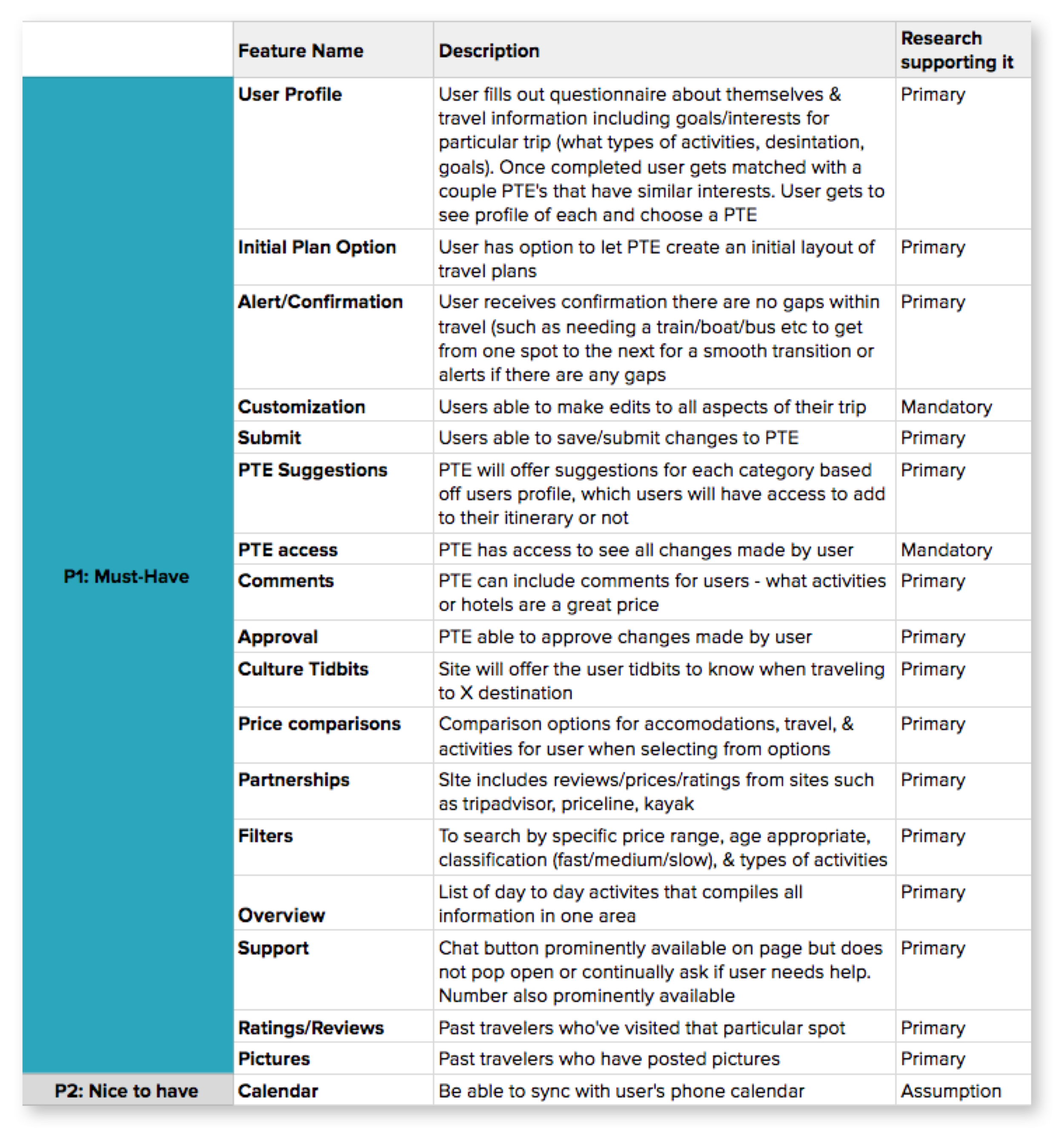
Product Feature Roadmap
Having the project goals in mind, I started listing out features needed to allow users to successfully pick out furniture and place it within their homes.

Ideate
Branding
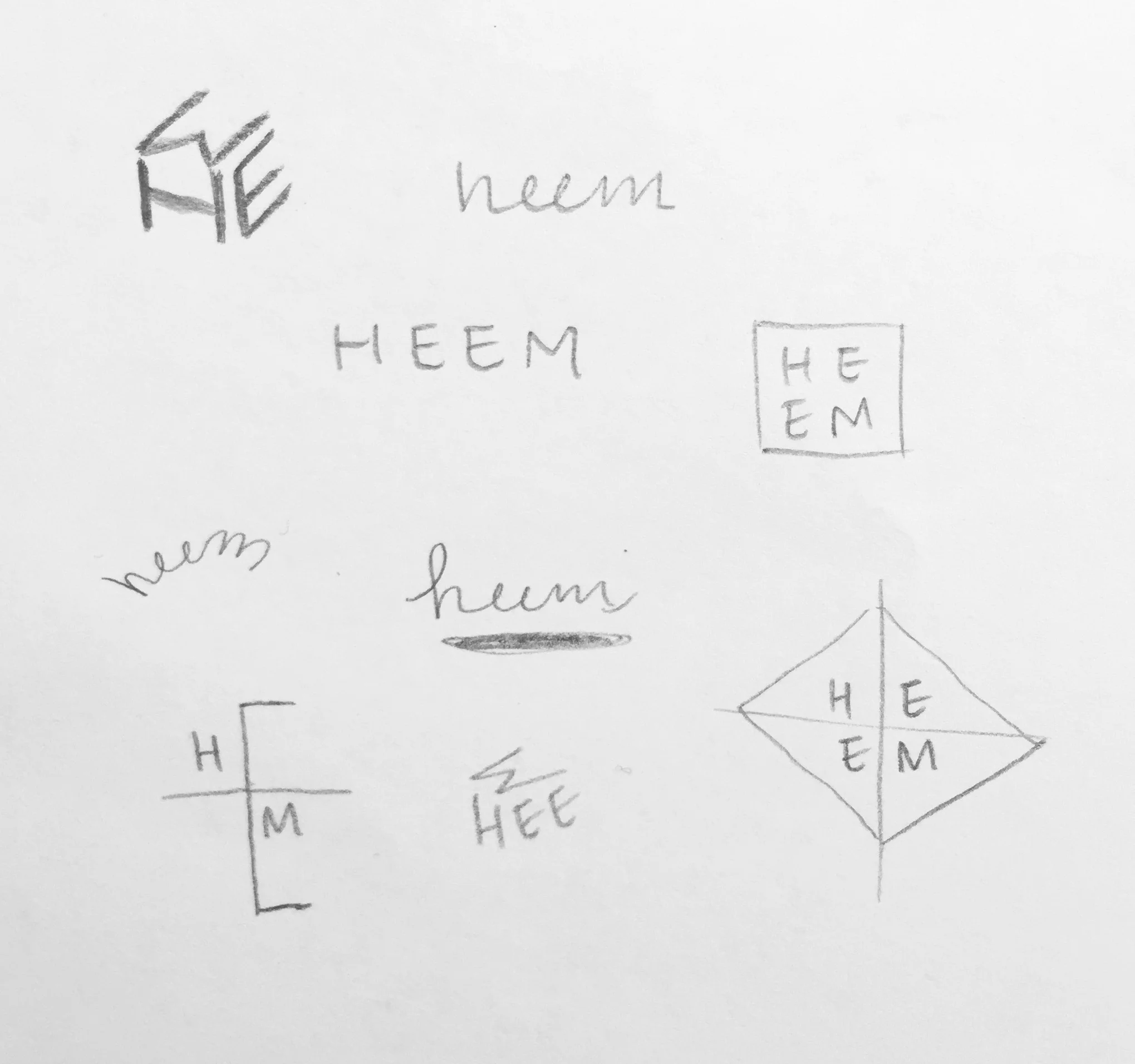
Another part of this project was to create a logo as their brand is not defined. I started sketching logo ideas and then quickly moved into Sketch. Once I was able to finalize the logo, I put together a style tile which incorporates the final logo, color palette and typeface.


Prototype
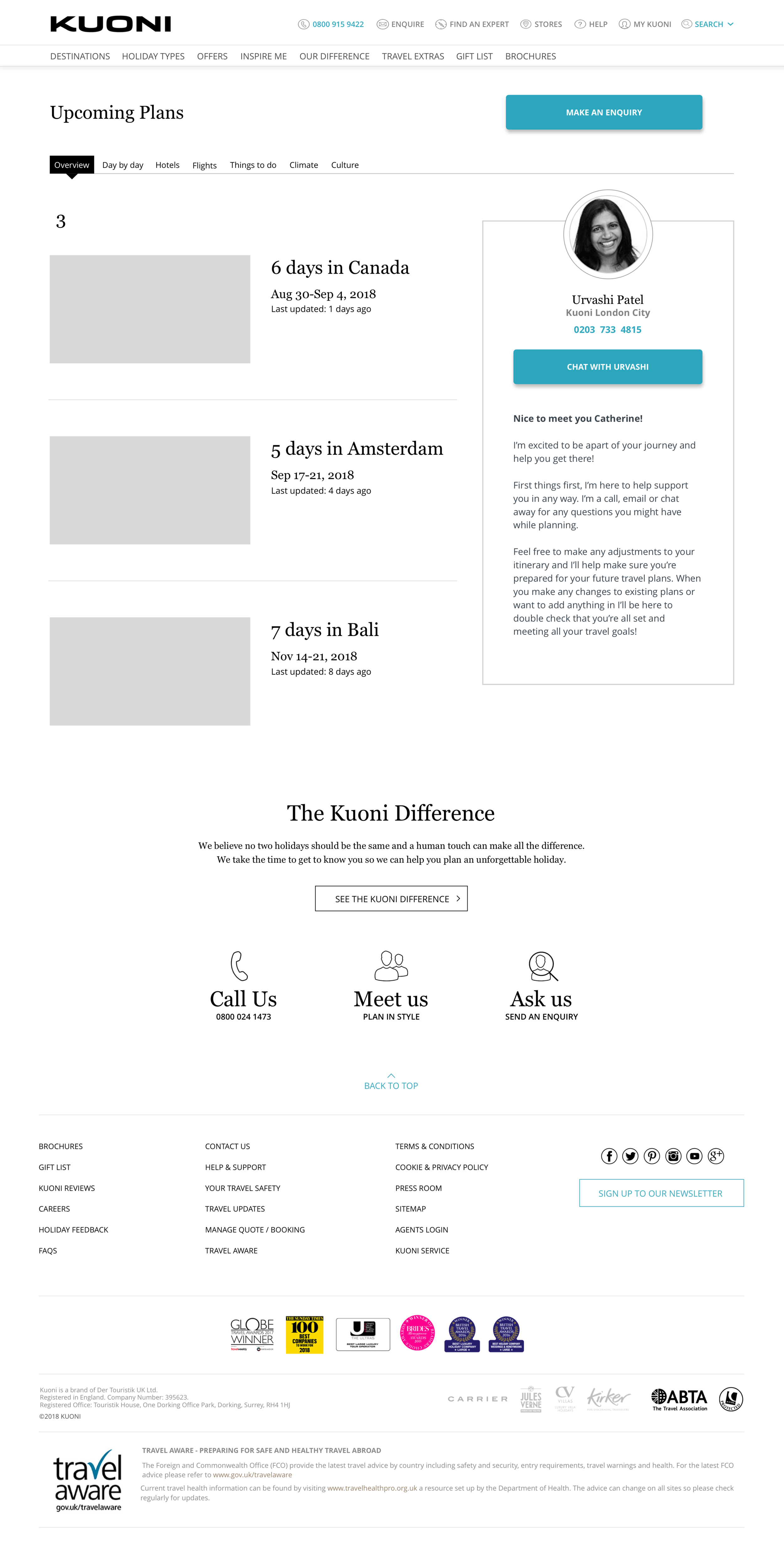
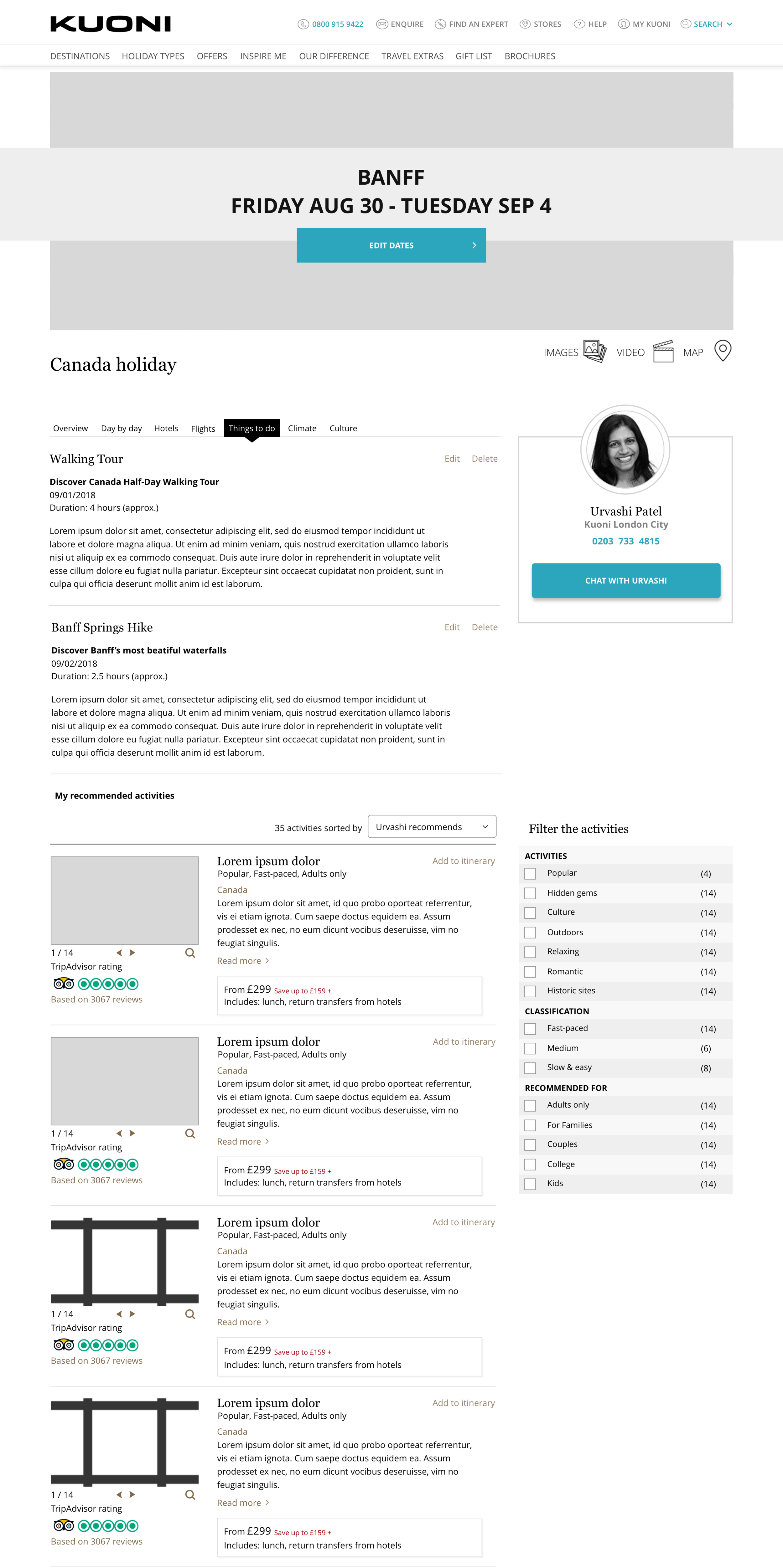
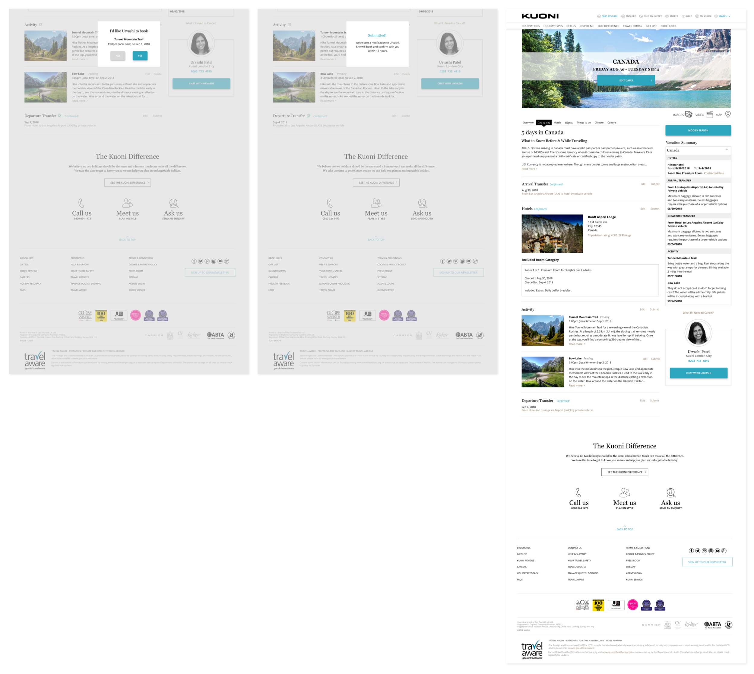
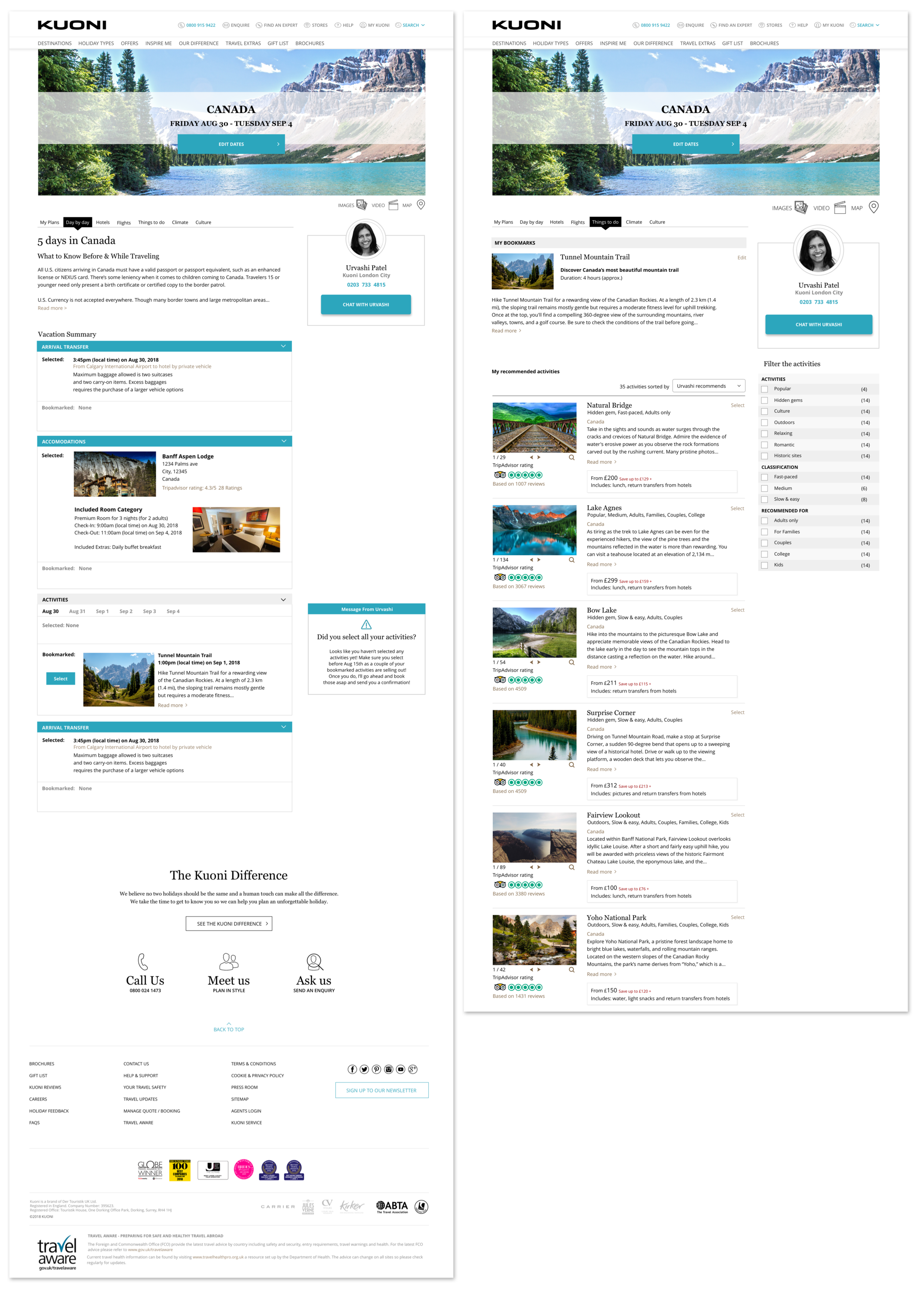
High Fidelity Wireframes
With Heem’s branding defined, I worked on incorporating their identity to create final, high fidelity wireframes and a final prototype.
We start with the welcome and onboarding screens.

Next the user is instructed to scan and browse for furniture. The products are organized by room as most users shop this way. Once they select a room, they’re able to filter and dive deeper into that category.

Here the user is able to see all the details of a product and can favorite, view in room, or add to cart. If the user selects view in room, they’re able to swap colors and interact with the furniture in their home.

Lastly, these next few screens showcase if a user selects an item as a favorite, logging back in, and seeing what they had previously set as favorites.

Testing
I created a prototype using InVision and conducted user testing with 2 participants ages 26 & 30. Both participants were male and the tests were conducted in person and remotely using Google Hangouts.
Objectives
How do users feel about each process?
Observe if users run into issues or confusions within each page
How do users feel about the flow and placement of buttons
Goals
Evaluate the users process and interaction with Heem’s app
Identify any pain points and confusions with flow and buttons
Identify if users are able to find saved items easily and is found where expected
Key Findings
Successes
All participants were able to successfully complete each task
All participants felt each process was intuitive
Frustrations & Confusions
Mixed reviews about whether there was enough information after opening the app
One participant was reluctant to allow camera access without further information
One participant wanted the option to add multiple pieces of furniture at once
Next Steps
Reiterate and modify prototype based on users feedback
Repeat usability test to evaluate my solutions and see if any new issues arise